Research
Different types of magazine genres:
- Teen
- Gossip
- Gardening
- Video games
- Fashion
- Lifestyle
- Football
- Health
- Music
- Entertainment and TV
Sports:
- Men's sports
- Women sports
- Mountain bikes
- Motto cross
- Football
- Ruby
Health:
- Men's health
- Women health
- Kids health
Music:
- Vibe
- R&B
- Hip Hop
- Rock
- Indie
- Contents
Fashion:
- Men's fashion
- Women fashion
- Style
Films:
I wanted to research other magazines that are similar to mine this is what I could find:
I had found this magazine cover
MASK (Mothers Awareness on School-age Kids) Magazine: The Bully Issue - Spring 2011 www.MASKmatters.org This is a charity that also publishes magazines and other print-based media like a website and also some newsletters. At first, I didn't know that this was a real magazine so I decided to look into it more which I had come across a website address and there it took me to the home page of MASK which I saw was a professional website that holds donations and other information about the business. After a long time of finding the magazine contents and looking at more information about the website, I had found some information.
MASK
- MASK (Mothers Awareness on School-age Kids) is a non-profit 501 (c)(3) organisation created in 2007 by a group of dedicated mothers who recognised the need to consistently educate families on rapidly changing issues.
MASK (Mothers Awareness on School-age Kids) is a non-profit 501 (c)(3) organisation created in 2007 by a group of dedicated mothers who recognised the need to consistently educate families on rapidly changing issues. The MASK mission is to engage and educate parents, children and the community about the issues facing youth and to empower children to make safe, healthy choices.
MASK fulfils its mission by engaging, educating and empowering families through the MASK E3 Institute, MASK The Magazine, an informative website, and the MASKMatters App.
MASK helps children learn invaluable life skills for how to cope with several issues including responding to peer pressure, dealing with trauma and technology-related challenges. In today’s viral and social media world, coping skills are more necessary than ever. MASK equips students to feel confident regulating their emotions, maintaining frustration tolerance and setting healthy boundaries. MASK has served the community, for over a decade, intending to strengthen parent-child bonds and empower children to make decisions from a place of knowledge and confidence that will prepare them to thrive.
There are 3 different types of MASK under the same company:

The MASKMatters app gives students, parents, and teachers age-appropriate resources and is available in Spanish. Giving modern-day parenting solutions right at your fingertips. Giving the viewers the current information has never been easier or more convenient. This app is available on Apple and Google Play that easily accessed from both apple and android.
The MASK E3 Institute is a comprehensive year-long multi-year approach to building and strengthening life skills for children, including MASK Story-time (Pre-K), MASK Academy (kindergarten-6th grade), MASK Prep (middle and high school), MASK Leadership (college) and Parent University. This digital format teaches pre-kindergarten through college-age students social-emotional skills and tackles important topics – from drugs and alcohol to bullying and Internet safety – and gives students and parents knowledge and tools to manage these potential challenges. Which also acts as a council for the children and teens that go through hard, intense times.

MASK The Magazine is the parenting manual offering solutions to the modern-day challenges families face. Each issue of the award-winning MASK The Magazine tackles a specific topic in-depth and examines how it can affect kids from pre-kindergarten to college. Readers will learn age-appropriate conversation starters, which can help open the lines of communication between parents and children. What I liked about this was the viewers could participate by uploading their own magazine creations by following the standards and the requirements which then Is an interactive audience not only helping share the message of the business but also keeping the viewers engage within the business.
They also have a youtube account that upload videos on different content ranging from information and statistics about bullying and doing illegal substances and, interviews of the team and explaining why it is important to listen and keep your child safe. But from hearing the accents in the videos and looking at the target audience the viewers are mainly Americans. By looking at the details of the contact page it was based in America so the charity is not international only based In France, Germany, Spain.

Sponsor behind the MASK: Fairmont Scottsdale Princess:
"A member of the MASK Leaders of Distinction Advisory Council, Miller strongly believes in the importance of family connection. When it comes to his own children, his highest priority is spending time with them.“As a father, it’s very important for me to be with them, to listen to them and to show interest in their lives,” says Miller. “And even though we can all be busy, we make sure to have dinner together whenever we can. This encourages family communication. At the resort, we believe the MASK mission strengthens families, much like our own mission of turning family time into memories of a lifetime.”
Fairmont Scottsdale Princess
This website was created on the 6th February of 2011 and not published till the 8th of April 2011 to the public for the United States. Not only this charity creates free magazines to help with bullying providing some tips about the pathway out of bullying - but it holds a promotional website that not just only holds the magazine but other media products and information. I am doing something similar to a magazine and a promotional website like MASK.
PEOPLE
This magazine isn't really helping the bullying situation but it is reporting it and writing in the double-page spread about the girl who got "BULLIED TO DEATH" When I saw this I knew it was just like a report of something. Just reporting something and this was the recent news and then a week later doesn't care and moves on. So this is not what I want my magazine to look like. People.comPeople magazine is an American weekly magazine that specialises in celebrity news, human-interest stories, and gossip. It is published by Meredith Corporation. Again both magazines I could find that were real were based for Americans could not find a British magazine about bullying or violence.
People Magazine was created in 1902, Des Moines, Iowa, United States. The first published magazine was released on the 4th March 1974 and the first magazine was People Weekly Magazine (First Issue) March 4, 1974 (Mia Farrow "Gatsby" cover) Paperback – January 1, 1974. Publishing 52 magazines in one year, publishing news and gossip.
The target audience age demographic is between the ages of 16-45. 70% are women that are aged 38. When broken down by gender, younger men read this magazine more often than younger women.
Just by looking at the websites, I would say People's magazine is not only more recognise but the website are structure differently the people website looks more professional than MASK. But, the MASK magazine looks more professional and less tacky than People's magazine. The MASK magazine is more approachable in looks wise than People's magazine. In my opinion, People's magazine looks like a down version of The sun a British magazine.
Then I wanted to look at some charities and campaigns relating to bullying and violence:
LOVE MYSELF CAMPAIGN BTS
LOVE the MYSELF Campaign. BTS collaborates with the United Nations Children's Fund (UNICEF) to stage campaigns against violence towards children and teens around the world, with the hope of making the world a better place through music. This campaign was created on November 1, 2017. Love Myself (stylised as LOVE MYSELF) is a two-year, anti-violence campaign launched on November 1, 2017, by the South Korean boy band BTS in partnership with the Korean and Japanese Committee for UNICEF.
BTS creating this amazing campaign not only for the young fans they have but for the youth of the world protecting them from any sort of verbal or physical violence which covers bullying in schools and colleges as well. In an attempt to sponsor a campaign called #ENDviolence—UNICEF’s global campaign aimed at ensuring children and teens in the world lead safe and healthy lives without the fear of violence. Not only the workers of UNICEF and the members of BTS have stepped up to help but regular UNICEF supporters and BTS fandom "ARMY" steps up to help all children and teens at schools all over the world face the dark spots of the world.

"BTS has always been conscious of caring for the world. Ever since their debut in 2013, they have been focused on providing messages of comfort for young people. They never hesitate to express social messages in songs as well as music videos. The member artists of BTS strive, in their own ways, to make the world a better place to live. As part of this, BTS released the first album of a series with the concept of Love Yourself in September 2017 and talked about the meaning of true love in songs featured on the album.Find love in myself, embrace people and society in a larger sense with love.” This is what BTS has pursued, and will pursue, through the Love Yourself album series and LOVE MYSELF campaign. Since all BTS members are now in their 20s, they are going to raise their voice to support young people in this world. They insist that the future should be different from the past as they are now the pillar of society. People need to speak of love and lingering hope, they say, even in this world wracked with hatred and violence. Now, BTS and UNICEF call for broader participation in the LOVE MYSELF campaign pursuing true love and sharing."
As they said they wanted to make the world a better place through their music so I wanted to research Into the albums they have connected this campaign to. There were 3 albums Her, Tear, Answer all albums with different songs connecting to violence and self-love. These are the albums:
"Love yourself: Answer" means “Love Yourself: Answer” draws the series to a close with a more
hopeful, energetic air. The boys sing of accepting themselves and their flaws, of how loving oneself is how to truly find your way through relationships and life as a whole.
"Love yourself tear" this album is the second instalment of the Love Yourself 起承転結 series. This
album follows a darker concept than the first instalment ‘Her’, as mentioned by the leader of BTS, Kim Namjoon. In this album, the members expose the complexity of love by touching upon the dark aspects of it. This builds on the underlying theme of the Love Yourself series: before you can truly love someone else, you must first be able to love yourself.
"Love yourself: Her", basically, I think Highlight Reels is an introduction to the Love Yourself series
which is the visualisation of every album’s theme. The acts are separated into 4 parts: Wonder, Her, Tear and Answer, just like the albums.
For the campaign the target audience is being the younger generation will be supportive of the campaign due to the love that we have for them and their music. But here are some information for the audiences of BTS:
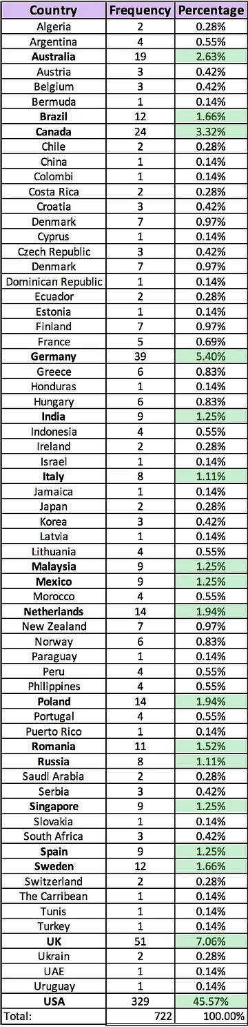
This is the results of the population of BTS listeners from different countries.
This the percentages and the frequencies for the countries.

These are the ages of the audiences and I was shocked that this boyband is being so stereotyped into their audience was screaming hormonal girls but looking at these results this shocked me that it goes up to 49.
Bullying UK
This is another campaign but this one is only based In UK. When looking at the website for the first time I thought very kiddish and childlike so I automatically thought the target audience was 5-13 ages so primary school bullying. Which my magazine does not go down that low in ages it goes to 11-18 years of age. Even though it is relating to the topic of my magazine I wanted to research some more information. So I could not find the exact target audience age but I did some research into the pages and see it goes up to secondary years teens which I was surprised at. This campaign/charity was founded in 1999 by journalist Liz Carnell and her son John. The charity's website was redesigned and relaunched in 2006 with a large amount of new information to help pupils, parents and schools deal with bullying.
They help with a range of situation which is great for a wide audience especially in schools and college, not just the students but the families as they said they want to help families with bad situations wanting to make them happy. They also have people who you can speak to.
Magazines:
I am going to be mainly looking at two magazines and also their promotional website called Elle and Vogue very known magazines often celebrities showing on the front cover. I wanted not only to look at some inspiration for the way they structure them but how they write in the magazine, also wanted to look at how they layout their magazine promotional website.
This is the website for Elle and just looking at it the main centre of attention is the model and the eye-catching blazer and just the way the website is constructed.
The website by itself is very simple and plain and minimal colours etc. But I find that professional and well-known fashion magazine companies are very simple and not a lot of content but very informative.
It has its fashion images and information. It is very engaging has it has lots of pictures making the website more fun to look at and it keep the audience interactive.
It has a vast amount of topics you can look at and read about and then has some mini-articles you can read. It has some tips and tricks and where to get the products from and how much. So the audience does not have to hunt for the products. As well as short articles it has long articles you can read about different topics you can read about beauty or culture or fashion different things.
Elle is one of the largest fashion magazines worldwide. With 69 million readers. Found in France in 1945 and the target audience for ell magazine is young women ages 16-40 dynamic audience. Elle translates to ''she'' that's why they wanted their magazine to be only for women and girls.
The publisher for the Elle magazine is called my Hachette Fillpachi is the largest magazine publisher. Elle UK has its own website Elle.uk.com, which was launched in November 2010 and the magazine growth increased. The magazine mainly focuses on the latest fashion and beauty trends. The advertisements for the magazines are mainly fashion and beauty trends to increase the profit of Elle and the beauty and fashion brands.
They would use
Lily Allen because it immediately appeals to the audience as it is a face someone would recognise. Lily poses with a subtle and 'model-like look on her face; this gives lily and the cover a high fashion appeal. Lily also bears her hands on the cheek of her hips posed to the side which portrays a strong and independent female. The clothes worn on the cover of ELLE is highly important, in this case, lily bears a dress made of lace and patterned star fabric. With this overall look, it is clear that the target audience is a young female interested in fashion and celebrity lifestyle. ''ELLE'' but as the magazine is a well-known magazine it does not affect the recognition of the magazine. This elegant typeface is continued on the subtitles of the magazine, which vary from black and white font colours. These subtitles give the cover a very simple and stylish feel and are responsible for giving short insights into features inside the magazine.
With just these simple subtitles, it focuses more attention on the cover girl, Lily Allen and her interview which is one of the key features of this issue. However, ELLE does have a similar look to the other leading high fashion magazines ''VOGUE'', with its chic spaced out font as well as baring other celebrity features on its cover. However, it differs in content in the fact that ELLE features high street fashion as well as couture whereas VOGUE is renowned for just its couture content.
ELLE's presentation on the cover is very simple. The subtitles are based on the side of lily's shot with a larger eye-catching phrase in front of Lily's dress. With no other pictures on the cover and just text, it gives the magazine an expensive and smart look. Overall, the presentation is based on the colour of Lily Allen's photo which has a purple background to it. Therefore the colour of the font (Black and white) is chosen to contrast with the colour theme of the photo. Overall, with this complimenting colour, centre image and side titles it gives a stylish cover that will appeal to its target audience.
The 'mode of address' of the magazine
ELLE begins addressing its reader with an Editor's letter, which addresses the reader as ''you''. ELLE has a range of articles split in Beauty/travel/fashion/edits/cover which is on its contents page. Mainly, Beauty and fashion are its focus being a fashion magazine, with articles ''How to work autumn/winter trends'' and a ''Beauty hotlist''.
VOGUE is the most famous and popular fashion magazine for women, which was firstly published in 1892 by the Conde' Nast Publications publishing house. Nowadays VOGUE magazine is popular all over the world and is published in 18 countries: UK, U.S., Australia, Brazil, Portugal, Russia, China, France, Germany, Greece, India, Italy, Japan, Republic of Korea, Spain, Switzerland, Taiwan and is called one of the greatest magazines in the world's market.
Nowadays the magazine is positioned as respectable and worthy of attention, this is a magazine about the life of society, fashion and lifestyle. From the very first issue, it became clear that is not just another magazine about women's fashion but the restrained and respectable edition of the fashionable world. VOGIE targets viewers that are young women like ELLE but VOGUE is 20-40 years of age, who are successful and beautiful and who wants to be aware of all the novelties of fashion and beauty. These are mostly wealthy women but editors try to maximize the target audience of the journal, focusing on the fact that high fashion is accessible to all, not only for the elite.
Vogue has Its own media kit consisting of things like their readership and daily income a very specific view of their target audience. We were looking at this PDF file back last year for reference for our own target audience and how close they get and how specific they go into it. As well as their target audience they give information about all their editors in the company and little things also including their advertisements they will add in the magazine and why they have added that piece of information In. This is some of the information that projects out to me the most and helps me pick my target audience and learn from them. I am going to be looking at the British viewers and audience:
(Page 1)
20M TOTAL REACH
190K CIRCULATION
6M DIGITAL UNIQUES
£130K AVERAGE HHI
95% SEE JEWELLERY AS GOOD INVESTMENT
£7.9K AVERAGE ANNUAL SPEND ON FAS
796K READERSHIP
14M SOCIAL FOLLOWERS
72% ABC1
59% LONDON / SE
87% VALUE TRAVELLING ABROAD HIGHLY
£2.9K AVERAGE ANNUAL SPEND ON BEAUTY & WELLNESS
As they mention on the first page British Vogue mainly focuses on fashion, beauty and lifestyle. Reaching out to mostly young women and fashion and lifestyle are aimed at young women. They update this file every year so this is the latest one that was updated this year.
Fashion
The most viewed topic in the Vogue magazine will have to be fashion as It is the most impactful and dominant in the magazine. The fashion topic covering stories of fashion in the media and the shooting of the covers.
Beauty
Beauty ranges from different elements like different brands and the quality of the brand and most advertisements. Read and listen to the celebrities different thoughts and views on certain products in articles and usually the exact speech will be big and noticeable capturing the views eye and automatically first impression of the products.
Watches & Jewellery
''British Vogue now producers more watches and jewellery editorial than ever before within coverage in this sector up to 90%.''. (Vanessa Kingori MBE 2021) Almost as dominating as the fashion
Arts and Culture
The Vogue magazine almost acts as an event planner for the viewers as it lost all the different beauty and fashion events that are happening and upcoming talents in the as well. Interviewing and showcasing in addition to the arts and culture.
Travel
Sharing popular travel trends that trend on social media like Instagram, Tik Tok and Snapchat and Pinterest. They each have a month where some pages are consisting the same things and same topic:
SPECIAL SECTIONS
FEBRUARY Vogue Travel Guide
APRIL Shop The Season
MAY Watches
JUNE Vogue Weddings
JULY Arts & Culture, Mini Vogue
AUGUST Jewellery, Wellness
SEPTEMBER Clean Beauty
OCTOBER Shop The Season
NOVEMBER Food & Drink, Vogue Skincare
DECEMBER The Vogue Wish List
JANUARY Vogue Living
Analysing a front cover:
This is my analysis of Kate Moss Vogue front cover.
Codes/conventions and terminology for the magazine:
This is the terminology for the cover of a magazine.
Typography: Font
Serif-fonts with fancy type
Sans Serif - Fonts without fancy type
Drop Cap: The first letter of the article tends to be in a large/ different font. Attracting the audience.
Main Image: Typically showing the person or object directly associated with the main feature /article.
A Master head: The title used by known typography to make the readers familiar with what magazine they are reading/
Selling line/ Strapline: An introductory headline below the master head describing the magazine
Pug: Can be either be at the top left or/and right-hand corners of the front cover. The prices of the appear, the logo or promotion are positioned there or even a freebie is placed there to catch the readers eye.
Tag: The word or phrase is used to engage a readers' interest in a story by categorising it e.g. 'Exclusive', 'Sensational', this is showing that the magazine has a high compliment.
Cover lines: This is very needed in articles inside the magazines are stated through the cell lines, these are regularly seen at the right-hand side of the cover.
Barcode and price tag
Top and bottom strip: These are the strips places below or on top of the magazine that gives us a further look and information on what the magazine could include. Mostly being the most interesting parts.
Front covers: The more professional magazines tend to include more bold and large font and text for the master head and the large image of an icon celebrity, tied in with genre, is used as the main image. I will. The colour scheme will always be consistent within the front cover and throughout the article.
Gratification theory is a good way to attract attention from readers. The use of hermeneutic codes also draws in attention by using ambiguous text with is open for the entices audience to read into the magazines. Mostly magazine companies will add a popular artist or band or actor to draw in the fandoms to also receive the views and buys of the magazine. As theorist Henry Jenkins ''Fans appropriate texts and read them in ways that are not fully intended by the media producers (‘textual poaching’). Examples of this may manifest in conventions, fan fiction and so on. Rather than just play a video game or watch a TV show, fans construct their social and cultural identities through borrowing and utilising mass culture images, and may use this ‘subcultural capital’ to form social bonds. For example, through online forums like Reddit or 4chan. The fans will buy the content because they have something about their interest and not read the rest of the media product.
Gratification Theory: Uses and gratifications characterise people as active and motivated in selecting the media they choose to consume. The theory relies on two principles: media users are active in their selection of the media they consume, and they are aware of their reasons for selecting different media options.
Hermeneutic and Proairetic codes: The hermeneutic codes refer to those plot elements that raise questions on the part of the reader of a text or the viewer of a film. The Proairetic codes on the other hand are referred to actions. Those who plot events that simply lead to yet other actions.
Contents Pages: All magazines have looked at their contents page as one single page sometimes even double-page spread. There is also one image of the main focus of the magazines, usually the one who features on the front cover to provide further insight into the magazine.
Double Page Spread: For the magazine of my genre that I have researched I found a convention with they all have. The right side of the page will consist of a large Image with the left side featuring the article. The cover model also is the feature of the double-page spread. Also, the structure of the articles are similar with slight variances and all have large headers. The colours scheme is also consistent again followed through the whole magazine.
Psychology of Colours
Red
Red is a very powerful, dynamic colour that reflects our physical needs and actions. Red is also energising which means friendliness and strength, out then also shows demanding and aggression.
Common was seen: Stop lights, valentines and horror films.
Orange
Orange has that context of being a comfort for viewers which lights a sense of warmth. A colour of motivation - positive energy enthusiasm for life.
Common seen: Fruits, Sporting events, Bored games
Yellow
Yellow is a sense of happiness and joy and cheerful, optimism. One of the most popular psychological colours. But too much yellow can cause self-esteem problems and anxiety.
Common seen: Smiley faces, displays on shop windows and traffic crossing.
Green
Green indicates a sense of balance and harmony. Green is the most seen as nature reflecting life. Portrays health to relieve stress. But sometimes means over possession and materialism.
Common has seen: Nature, economic exchange, health-based stores and restaurants.
Blue
Known as trust and dependently. Mental smoothing. One of the most like colours in the world. Blue lends a more mental reaction. But blue is known for being distant and cold ad finally unfriendly.
Common seen: Workout facilities, Hospital and Spa
Purple
Common known for being Imaginative and spiritual. Purple is often to show luxury, loyalty, courage, mystery and magic. Creativity is associated with purple. But purple can lead to distraction or introspection.
Common was seen: Magic shows, fairy tales, luxury products
Inspiration from the different magazine and what I like and don't like:
This is one of the double-page spread I liked about it. I liked the structure quite unique than the rest of the magazine articles the double age spread adding large and medium images and big bold text and the chosen colours all work very well making it very eye-catching and made me want to read the articles. They have challenged other professional magazines by adapting and going with something that stands out.
The main reason I had labelled this as one of my favourite double-page spread is because of the layout of the magazine looking like a newspaper inside of a magazine which I thought stood out to me clearly and I thought it was such a cool Idea. The chosen colours go well with the images and the font of the typography and the layout of the article makes it more engaging and fun to read.
I spotted this as I have mentioned before this is a typical style of the magazine double-page spread. A large image on the left dominating the page with bold writing. Then the right side is the article which is clearly shown in this image this is supposed to have a more simple and professional look. The more simple the page the more it looks professional very subtle.
This style of the double-page spread also appeals to me due to the layout and structure of the page. I liked the different colours the colours in the images also parallel with the colour chosen with more different words and boxes. Again I liked the medium size images along with the placement of them this page just eye-catching as the first thing I see is the pop of neon yellow colour which I associate happiness and passionate.
I liked the very simple look this magazine had to offer as the text is bold and large making it the first thing I see when I look at this page. The minimised article which good as the images are more dominating than the writing which is usually the other way round. Then quote most pages have these as they are like a shred of evidence that supports your topic of the page.
This is the contents page for the ''GRAZIA'' magazine which was published on the 5th of April 2021, for my magazine I am creating I have to create a front cover and a contents page and a double-page spread I can add more If I have time. When talking to my tutor about different styles of content pages, he said not to make it like a menu from a pub because most magazines do this which turns out badly and not well planned out so I had found this contents page which I was taking inspiration from and I needed to look at some more. I liked the images with the number on which was engaging and interesting as I liked seeing images and I thought Images with numbers would make a good contents page.
I like this font very simple similar text wise to the one above and I like the big images almost dominating the page along with the small text. All the colours matching so well with each other the colours are simple but yet they work so well with each other. For my content page, I am most certainly going to be having a large image that takes half or even more of the photo. As my magazine is only going to be 4 pages I will just add some random pages and then I will add a picture that I took with the DLSR camera.
When I was looking at this content page I had a vast amount of thoughts trailing my mind, if this was a legit and professional website. As It looked like it wasn't and the colours did not match within each other and the images were poorly chosen.
I am loving this style of a large image taking over the page and how it has such an effect on the readers' view. My attention draws to the large image that is very
Primary research:
Google forms survey: Bullying Survey
I have done this survey to get a rough idea of my target audience. So I had a simple and planned idea that my target audience age group is going to be aimed at ages from 11-18, both women/girls and Men/Boys. They will be based within the UK. These were the year groups that had applied to me. And when looking there was a range of different ages that applied to me which I was happy as I can confirm my age group for my audience which is going to be 11-18 secondary to college/ sixth form.
There was a great difference between the genders and I had predicted that women would be more dominant than males. But I want my magazine to apply to both genders, not just one as all genders get bullied in secondary or college. So my target audience is a specific but large group.
I was very much surprised at these answers because all schools have experienced bullying but then it also proves my point on being silent about bullying students do not tend to talk or show how they got bullied or when they got bullied. Mostly more popular and well-known students will say no to cover the fact that they have experienced bullying. So which I was shocked about the results, I got what I predicted.
To some extent, I did feel relieved when I saw that some put always which is a good sign. I was also happy that the students did not put never otherwise I would feel bad for the students fearing to go to school and even stay there brings them fear. When I saw them sometimes I had mixed emotions happy that they didn't say never but also sometimes means yes and no, which worries me. This then also contradicts the answers from the last question of is bullying a problem in your school/ college. But yet it could mean different things.
When predicting the answers I may receive. For this one, I had predicted always and often because most students feel better when they leave school and they can be who they are and let their feelings out that they have kept in all day and get away from the people that had caused them pain. But when people say they never feel safe walking to and from school/college, they will gain more of the situation. It was happening even outside of college. The students worry and they fear that something will happen to them while they walk home, which makes me sad as I want students to feel safe and happy when they get home, relieved at the end of the day.
During COVID periods lessons have been online everything about education had been moved online which was praise to all students that they didn't have to attend college they could simply work from their own comfort space which then sounds good and happy. But no as some students have been studying they don't see that kids getting bullied or hearing the comments that people make of you in person because they are hidden behind a screen. So the Never answer was predicted. But Cyberbullying had increased by a great deal to students being at home social media has been embedded in their heads as a routine to check social media. Some students get cyberbullied but how would other students know this so they would say never. But then also the victims have probably spoken to friends and they have helped them. So for example I know someone who is getting bullied but they are online education.
I had predicted these students not admitting them being bullied some students just tend to keep all their emotions and does not share their tough times as they are worried about what they will say or will they judge them, but then also some students do not get bullied which is most likely the ''popular kids''. Some students are willing to tell friends, families, teacher or even professional help. Which is the whole point of my magazine to make people feel like they can speak to people about their rough patches and don't keep it all to yourself as you will make yourself unhealthy.
I had predicted this I knew that friends would be very high as I knew that because I had done the same thing I would tell my friends for that sense of friendship comfort which I sought and I am guessing other students did as well. They will not most likely go teachers of family or even professional help as they fear the situation would get sorted and therefore raise awareness of the bully that they had told, I had been in the same situation. I had told the teacher and then not even minutes the bullying had been informed and came after me, that sense of fear of rising attention from the bully. Friends offer that sense of comfort for the victim as they help them feel happy which families and teachers can not relate to.
Bullying
When I think of bullying I think of colleges and secondary the most active places of bullying following along with cyberbullying. But before I talk about it I wanted to give you an insight into what bullying is. Bullying has unfortunately affected lots of people worldwide and it can happen anywhere and any time: at school/ college, travelling, to and from college, in sporting teams, in friendships and in a workplace.
Bullying is usually represented as behaviour that is repeated to intended to hurt someone either emotionally or physically. Often about their race, religion or sexual orientation or any aspects such as appearance or disability.
Bullying can take in different forms such as:
- Psychical bullying
- Social bullying
- Threatening bullying
- Name-calling
- Cyberbullying
Bullying includes:
- People calling you names.
- Making things up to get you into trouble.
- Hitting, pinching, biting, pushing and shoving.
- Taking things away from you.
- Damaging your belongings.
- Stealing your money.
- Taking your friends away from you or leaving you out.
- Posting insulting messages or rumours, in-person online.
- Threats and intimidation.
- Making silent or abusive phone calls.
- Sending you offensive texts or messages.
How Common Is Bullying
- About 20% of students ages 12-18 experienced bullying nationwide.
- Students ages 12–18 who reported being bullied said they thought those who bullied them:
- Had the ability to influence other students’ perception of them (56%).
- Had more social influence (50%).
- Were physically stronger or larger (40%).
- Had more money (31%).
Bullying in Schools
- Nationwide, 19% of students in years 7–13 report being bullied on school property.
- The following percentages of students ages 11-18 had experienced bullying in various places at school: Hallway or stairwell (43.4%), Classroom (42.1%), Cafeteria (26.8%), Outside on school grounds (21.9%), Online or text (15.3%), Toilets or Changing rooms (12.1%), Somewhere else in the school building (2.1%).
- Approximately 46% of students ages 11-18 who were bullied during the school year notified an adult at school about the bullying.
Websites (Promotional websites for magazines examples)
- Elle
- Vogue
- Grazia
- GQ
- TIME
- Cosmopolitan
This is the promotional website for the magazine GRAZIA which holds all the content and different articles and also some images relating to the stories they publish. This page is very simple as the top trending and the new articles added and at the top and also have some of their popular stories at the top and also ''Harry styles'' to grab viewers attention. I liked the structure of the page and layout of the articles dominating the page soon as the page opens making the viewers eyes attracted to the bigger things. They

have multiple pages on the top and the typography is bold and recognisable but when you scroll down the top banner containing the logo and the pages disappear making the page bigger. As usual, there would be some adverts n the website relating to the magazine. So ass you can see the Victoria Secret advertisement just under the pages and it is relating to the magazine as the magazine also holds articles and images about clothing, Victoria Secret being a clothing store and a beauty shop it matches well with the website and comes under the fashion and beauty pages.
Within the pages where are also different links/pages, you can go to so there are multiple choices to chose from that all have a different meaning but yet come under the same topic fashion for examples the page fashion in the fashion page they have 'HOW TO'', ''Fashion News'', ''Shopping'', ''trends''. Then you have the same page structure, the different articles relating to different stories. Also, the website has a website that links the products and once you click the products it takes you to the store where you can buy from which I thought was amazing.
For me when I clicked on the website and brought me to the home page I automatically thought boyish tone to the website. As I know GQ is a men's magazine I suspected the website to be a boyish tone as well to match the tone of the magazine. The layout is modern and I like the well-known celebrities on the home page make it very eye-catching. The bold typography also makes it eye-catching. The same amount of pages but bold font. Again the same
amount of pages but they also have different pages in those pages linking together but about different things. They have multiple articles from different editors and writers and they have their trending. But I like the modern bold look it's very eye-catching. They have the same layout articles when you scroll down and adverts relating to the genre and topics of the magazine.
Little insight of GQ:
GQ is an awards-wining men's monthly lifestyle magazine published by Conde' Nast, a major global magazine publisher. It was originally published in the USA as Gentlemen's Quarterly and launched in the UK In 1988. The magazine includes sections on fashion, grooming, culture and relationships which is added on the website on the pages. There are also stereotypically male interests. British GQ has a readership of over 400,000 and a circulation of 114,000. The average age of the reader is 34;80 per cent of its readers are ABC1. (ABC1 is A-senior managers and professionals, such as doctors and lawyers).
As I was looking through the websites the layout was somewhat the same the articles on the home page always having the newly/daily or trending articles at the top in large catching the viewers eyes. I think I like this layout for my magazine but the only problem is because I am doing only one double-page spread with one article there will be a problem. As I do not have multiple articles to do this layout so I will need to find a solution so my magazine can look professional as possible. Also, the different things about TIMES website the pages are different where you would suspect the pages to be on the top right of the home page but no They were placed within the 3 lines as a separate tab opens up with them there which I thought was unique. Also, the top left would be the logo, replaced by a subscription button. The Times website was very professional and classic from the website I feel like the audience is an older viewer.
I was very shocked when I saw this on the home page it was engaging as a teen this was really pleasant to the eye. Giving me a very much teenagers vibe. This what I suspect from a shopping website. The colours work altogether. When you scroll down the articles are all spaced from each other and fun and bold typography. The typography has a really nice comforting feel to it looks kind of kiddish like. They have the same layout as for the pages they have the more button and they have all their pages and they have double the amount of pages, ranging from all different topics and subjects. The largest demographic for Cosmopolitan is women aged 18-34 years. 45% of their readers are single. Over 65% of Cosmo readers are employed. The website gets over 4.6 million unique users per month. There are a lot of pink and black colours coming in contact with the website giving it a more feminist look.
Photoshop test
- This is my test for the editing process and I am getting used to using the software as I haven't used it in ages so I decided to use it again so I wanted to make sure I am starting to get familiar. I had used this portrait black and white image and decided to adding puff lines and sell lines. I did this before reading more into the terminology and the placement of the magazine to make it look professional. Then I did the test again to see how much I had improved from last time and this is what I had come up with:
I had changed the whole style of the magazine and decided to change the title to downwards as I want mine to stand out I decided to challenge the other magazines and it looks modern and fresh. With the colour bold red makes it even more recognisable and approachable and this magazine is someone can relate to as well.
I didn't want a over powering cover as I want someone to be to come towards not go away from the overload of sell lines and puff lines I tried to make it simple but yet engaging as possible. There is a great deal that has changed over all the fonts to the image and the contents. I have only focused on the cover today. But now I have had a good taste of photoshop as i was not that confident in the software.
Questions:
1. Explain how you strategically selected the five channels of research to support and develop your idea (you should have this written up already).
I have selected more than one research channel for my research. The channels I have selected are:
- Websites
- Campaigns
- Magazines
- Music
- PDF files
These are all secondary research that I have used. Secondary research involves the summary of things or an existing research. Secondary research is using primary research sources. I knew some off the research I needed to undertake and I also spoke with my tutor about the sources I may need.
2. Explain what secondary research you undertook and why. Describe how each channel contributes to the other giving you a body of secondary knowledge that develops your idea and develops your target audience profile.
Websites:
I have used this secondary research because of multiple reasons one being for theory work such as explanations of some things I did not understand and evidence like the vogue website. I used website to also build my own website WIX.
Campaigns
I have used campaigns supporting my topic of my magazine and that's bullying and violence because my magazine was inspired by the one of the campaign BTS LOVE MYSELF campaign that supported children dealing with violence and bullying in schools and colleges. So I also looked at Bullying.UK which helps with a similar topic but more of the bullying side then loving yourself.
Magazines
As magazines are such a great deal of my research I looked at some popular and well known websites like ELLE and Vogue which I used not only to gain inspiration but also to gain knowledge of the puff lines and sell lines as I had forgotten some terminology from magazine.
Music
I had additionally all ready start looking at BTS music that was part of the campaign that was part of my magazine research and the topic of the magazine was bullying and the love myself albums and let me really get a feel of what people thought about the subject.
PDF Files
I needed this for any additional information like a factsheet
3. Explain what primary research you undertook and why. Describe how it developed and further shaped your idea based on the information you used from your secondary research investigation(s). Say how this further develops your target audience profile.
I have done a survey that limits my target audience to help me what age group is and what I should do to to make them more dead on. So after collecting the results most of my prediction were correct and I just need to complete my behaviour etc.. This survey was to help me gain more of the demographics of the target audience. As my target audience will be UK based.
The questions I had asked was:
''What year are you in?'' : The most that answered was ages: 16-18. And this the older audience that I had planned.
''What's your gender?'': It was mostly females that had answered the survey.
''Is bullying a problem in your school/college?'': No, which shocked me.
''Do you feel safe in your school/college?'': Often
''Do you feel safe on your way and from college/school?'': Never
''During this school year how often have you been bullied?'': Never
''Who do you talk to if you have problems at college/school?'': friends
So the outcome of this survey was to make to confirm the demographics of my target audience did I have now got the demographics of my target audience for my magazine.
4. Explain how your research strategy overall developed your idea and evolved / developed your target audience
This research has helped me a lot doing terminology inspiration for example the terminology for the magazine I had learnt a lot on. Images to websites to campaigns like mine. As well looking Vogue PDF file of there audience and how specific they are and I need mine to be accurate and relevant to my project. Not only has the research taught me it has also changed my idea and they way I originally planned it. The layout has changed a vast amount due to terminology and what to add.
I also used software like way back machine to track when and what day a certain website was published and how long has it been going on for also good for referencing which brings me to my next point which is Harvard referencing making sure every piece of secondary research I use is all noted and when I accessed it.
5. Write up in detail your final target audience profile using the correct terminology. (Psychographic, Demographic, Behavioural, Geographic, AIO). Explain how your research investigation was important to direct you to this final profile. Give examples of where research channels support this profile.
My target audience is:
Demographics:
- Age: 11-18
- sex: All genders
- Income: £5,000
- Location: UK
- occupation: Any job.
- Level of education: GCSE-A levels
- Material Status: Single, married and taken and divorce.
- religion: All types of religion.
- Race: All races
- Ethnicity: All
- Sexual Orientation: All orientations
Wanting to welcome all people of different shapes and sizes to help overcome this unfortunate experience.
Geographic's:
- Village: All villages In the UK
- Local super market: All Tesco, Morrisons, Sainsbury, Aldi etc..
- Country: UK
- Nations: All nations in the UK
- Regions: All regions In the UK
Psychographic:
- Life Style: Children/ teens gets bullied at the their place of education. And bottles their emotions and don' talk to anyone.
- Social class: Upper Class – Elite. Upper Middle Class. Lower Middle Class. Working Class.
- Personality: Sad and depressed because of the bullying they has lost their true self they is not happy anymore. Or smiles all the time but yet is sad and lonely in the inside.
Behavioural:
- User status: Getting bullied.
- Usage rate: Seen but never approached
- Benefits: This will help them path a way out of bullying and hope they become happy again after reading this magazine.
- Occasions: Once they have read it I want them to follow my article go and tell someone they will help you overcome this and come out a stronger person.
- Loyalty: When someone is hurt or they see someone getting bullied they give them the magazine for a sense of comfort.
- Attitude: Be incisive about the whole magazine and then convince themselves they need it. Be happy they have found this magazine and they are happy after they get help.
Bibliography
Gordon-Lazareff,
H., 1996. Elle. [Online]
Available at: https://www.elle.com/
[Accessed 14th January 1997].
Kim
Amazon, K. s.-j. M. y. J. H. P. J. K. T. J. J., 2017. LOVE MYSELF CAMPAIGN.
[Online]
Available at: https://www.love-myself.org/eng/home/
[Accessed 1st November 2017].
KOLUCKI,
B., 1997. UNICEF. [Online]
Available at: https://www.unicef.org.uk/
[Accessed 12 October 1997].
Marcia
R, P.-. M., 2021. Magazine Typology from The Routledge, Handbook of magazine
Research. In: M. R. P. David Abrahamson, ed. The Future of the Magazine
from Routledge. s.l.: Taylor & Francis, p. 670.
Turnure,
A. B., 1996. VOGUE. [Online]
Available at: https://www.vogue.co.uk/
[Accessed 19th February 1997].
Cabral,
K., 2007. MASK. [Online]
Available at: https://www.maskmatters.org/
[Accessed 8 4 2008].
Corporation.,
M., 1974. People. [Online]
Available at: https://people.com/
[Accessed 25 1 1999].
Livias,
2021. Livia's Data. [Online]
Available at: https://liviasdata.wixsite.com/liviasdata/post/bts-army-survey-results
[Accessed 5 3 2021].
Liam Hackett, 2011, Stop Bullying.gov, U.S. Department of Health and Human Services, [Online], [Accessed 24 4 2021], https://www.stopbullying.gov/
Caroline, R., 2013. Social networks and Cyber-bullying among teenagers: EU Scientific e political report.. 1st ed. [ebook] Publications office, p.40. Available at: <https://www.researchgate.net/publication/264310203_Social_networks_and_Cyber-bullying_among_teenagers_EU_Scientific_e_political_report/citation/download> [Accessed 24 April 2021].
Allen, E., 2002. Guide to Literary and Critical Theory. [online] Cla.purdue.edu. Available at: <https://cla.purdue.edu/academic/english/theory/> [Accessed 24 April 2021]. [Online]
Remeka Washington-Wint. 2016. Elle Magazine Target Audience - Remeka Washington-Wint. [online] Available at: <http://www.lsbu-multimedia-journalists.co.uk/washingtonwint/2016/10/25/elle-magazine-target-audience/> [Accessed 24 April 2021]. [Online]
Neale, B., 1983. Grazia. [online] Grazia. Available at: <https://graziadaily.co.uk/> [Accessed 24 April 2021].
2019. Cosmopolitan Factsheet. 1st ed. [ebook] WJEC abac, p.5. Available at: <https://resource.download.wjec.co.uk/vtc/2016-17/16-17_1-32a/pdf/_eng/unit7/2-cosmopolitan-factsheet.pdf> [Accessed 24 April 2021].
Brown, H., 1886. Cosmopolitan.com - The Women's Magazine for Fashion, Sex Advice, Dating Tips, and Celebrity News. [online] Cosmopolitan. Available at: <https://www.cosmopolitan.com/> [Accessed 24 April 2021].
Broeke, T., 1952. British GQ - Men’s Style & Fashion, Politics, Trends and Culture. [online] British GQ. Available at: <https://www.gq-magazine.co.uk/> [Accessed 24 April 2021].
Felsenthal, E., 1923. TIME HOMEPAGE. [online] Time. Available at: <https://time.com/> [Accessed 24 April 2021].


Comments
Post a Comment