Planning
Planning
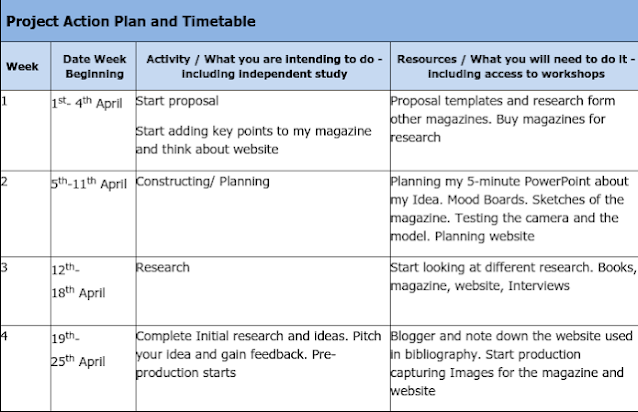
I had created an time table of the work I needed to complete leading up to when the project Is supposed to be handed In: This Is the time table of all the things I need to do.
My target audience is:
Demographics:
- Age: 11-18
- sex: All genders
- Income: £5,000
- Location: UK
- occupation: Any job.
- Level of education: GCSE-A levels
- Material Status: Single, married and taken and divorce.
- religion: All types of religion.
- Race: All races
- Ethnicity: All
- Sexual Orientation: All orientations
Geographic's:
- Village: All villages In the UK
- Local super market: All Tesco, Morrisons, Sainsbury, Aldi etc..
- Country: UK
- Nations: All nations in the UK
- Regions: All regions In the UK
Psychographic:
- Life Style: Children/ teens gets bullied at the their place of education. And bottles their emotions and don' talk to anyone.
- Social class: Upper Class – Elite. Upper Middle Class. Lower Middle Class. Working Class.
- Personality: Sad and depressed because of the bullying they has lost their true self they is not happy anymore. Or smiles all the time but yet is sad and lonely in the inside.
Behavioural:
- User status: Getting bullied.
- Usage rate: Seen but never approached
- Benefits: This will help them path a way out of bullying and hope they become happy again after reading this magazine.
- Occasions: Once they have read it I want them to follow my article go and tell someone they will help you overcome this and come out a stronger person.
- Loyalty: When someone is hurt or they see someone getting bullied they give them the magazine for a sense of comfort.
- Attitude: Be incisive about the whole magazine and then convince themselves they need it. Be happy they have found this magazine and they are happy after they get help.
My sketches:
Photoshop test
- This is my test for the editing process and I am getting used to using the software as I haven't used it in ages so I decided to use it again so I wanted to make sure I am starting to get familiar. I had used this portrait black and white image and decided to adding puff lines and sell lines. I did this before reading more into the terminology and the placement of the magazine to make it look professional. Then I did the test again to see how much I had improved from last time and this is what I had come up with:
I didn't want a over powering cover as I want someone to be to come towards not go away from the overload of sell lines and puff lines I tried to make it simple but yet engaging as possible. There is a great deal that has changed over all the fonts to the image and the contents. I have only focused on the cover today. But now I have had a good taste of photoshop as I was not that confident in the software.
I have decided to go with the black and grey and white and red colour scheme, as all colours have meanings and they relate to this a great deal. As I put in the research I have started to look at colour psychology and their meanings. Black meaning depression, sadness negativity. White means cold, empty ,distant . Grey means sad, unemotional, Indecisive. Red means anger, danger, aggression. All these emotions is how other people deal with bullying. I wanted bold typography because I want someone to see this magazine and be like fate they are meant to find this to help them overcome their bullying experience. As you can see in the second test I had changed the title the reason why I had changed it because the master head did not look right with the title Young Minds so I decided to change it to Shield because after some research their is a campaign called Young minds that actually helps with bullying so I didn't want copy so I decided to delete and come up with a a new title.
WIX
We are going to make an promotion website to support my FMP Magazine. We are doing to be Using the software called WIX a well known website builder that everyone using to build there websites. I was looking through the templates I was specially looking at the film related templates there was few I liked.
This was the first template that I had picked up and I liked the scroll technique and wanted something like that In my website. As I was thinking I could add that In my website and edit everything else.


Comments
Post a Comment